- Why did you pick the product you did?
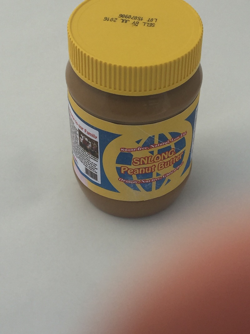
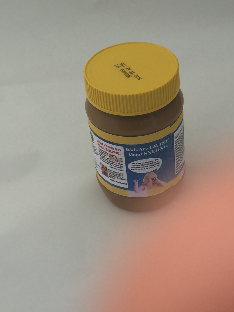
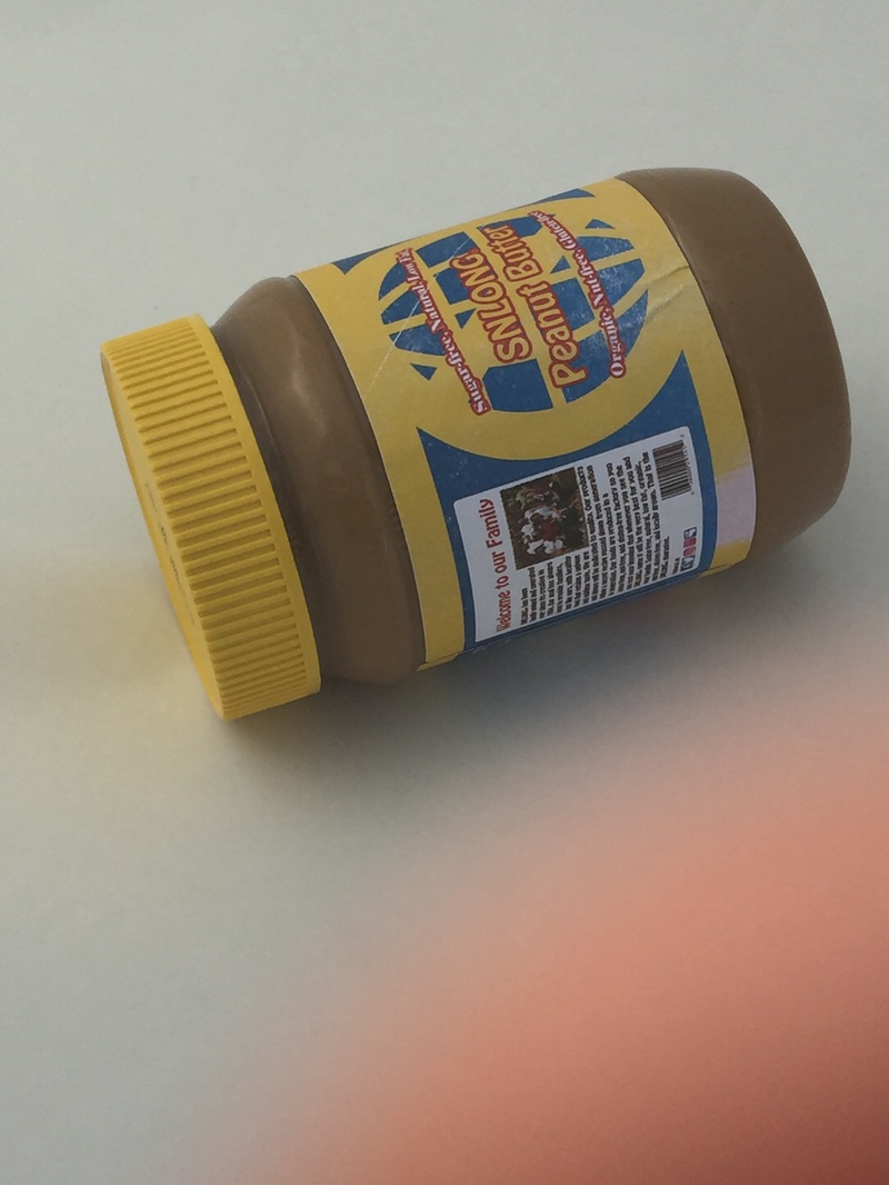
I went home and tried to find something that no one would eat. I stumbled upon some disgusting looking sun butter in the back of the pantry and assumed no one was brave enough to eat it, much less wanted to it. With this excavation I got a wonderful idea. I decided to make fun of the super healthy stuff that my Mom likes to buy. I don't mind eating healthily but sometimes she makes things that are disgusting. - How did you design your piece? Tell me your process.
I wanted to create something that could actually be a "real" label. I wanted it to look similar to the type of labels that you would find in stores so I took the color scheme of the original package and changed the layout and other aspects of the design. I created a company name and created the logo from there. - What is most successful about your design?
The design successfully looks like something you would find in a store while subtly getting its' message across. As I mentioned earlier it has many of the elements of a standard label such as ingredients, nutrition information, a company message, and others. - If you could change anything about the piece, what would you do and why?
The text on my piece looks weird. On the computer the text looked great but when printed out it looks considerably less good. It is too small to read easily. The colors also look different when printed. The printed yellows look different from the pre- existing yellow that was on the package beforehand. If I could change something I would fix the colors and the text.
 RSS Feed
